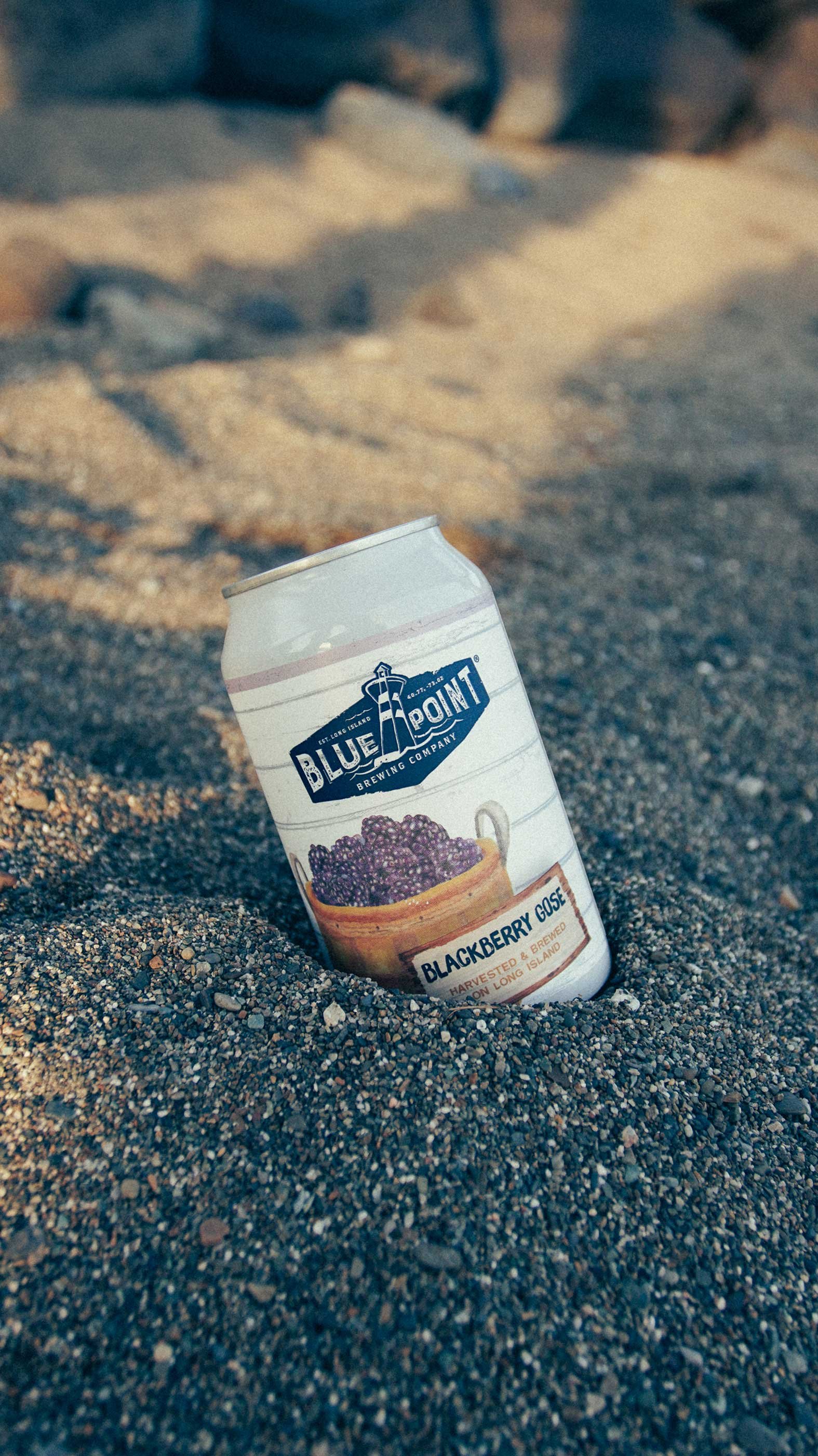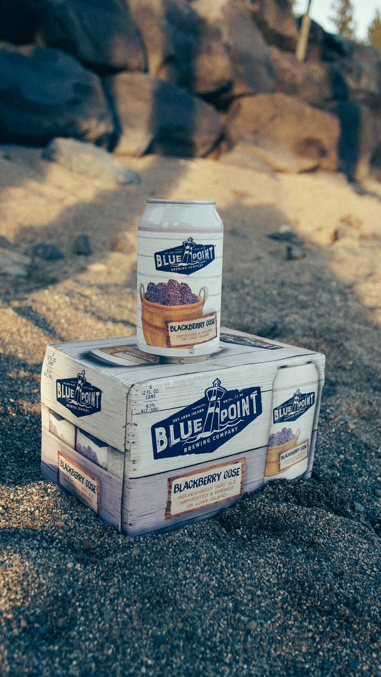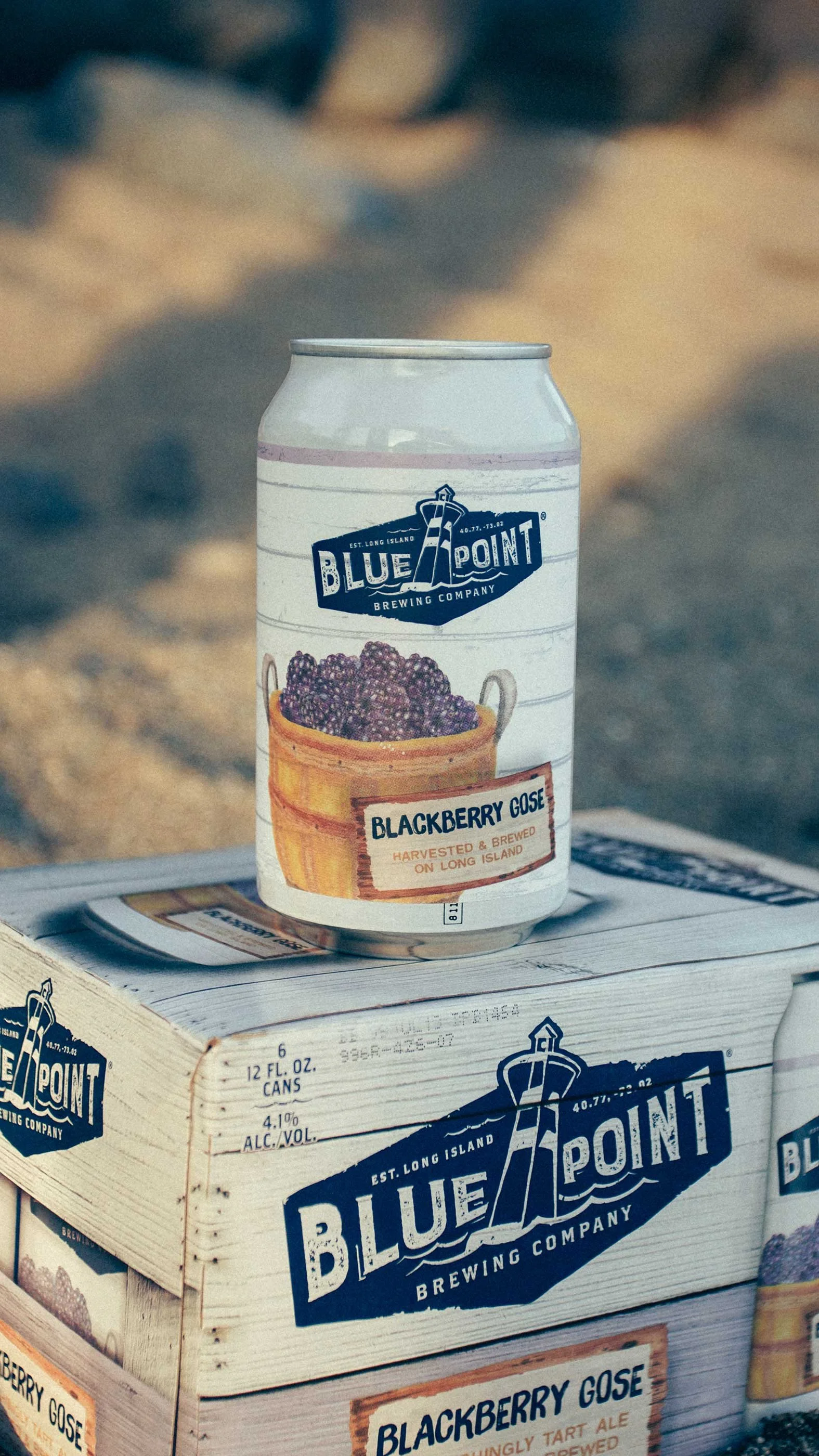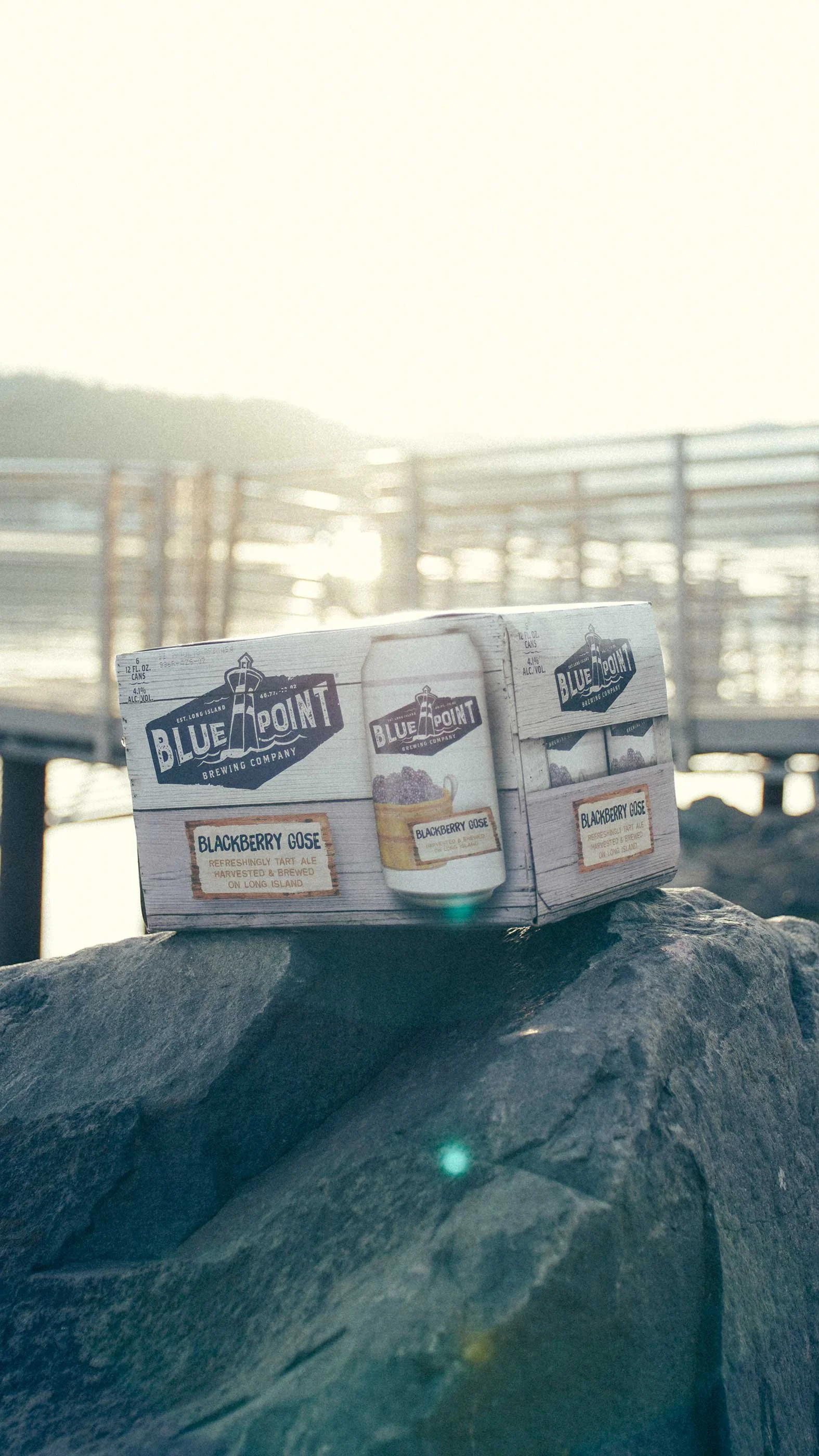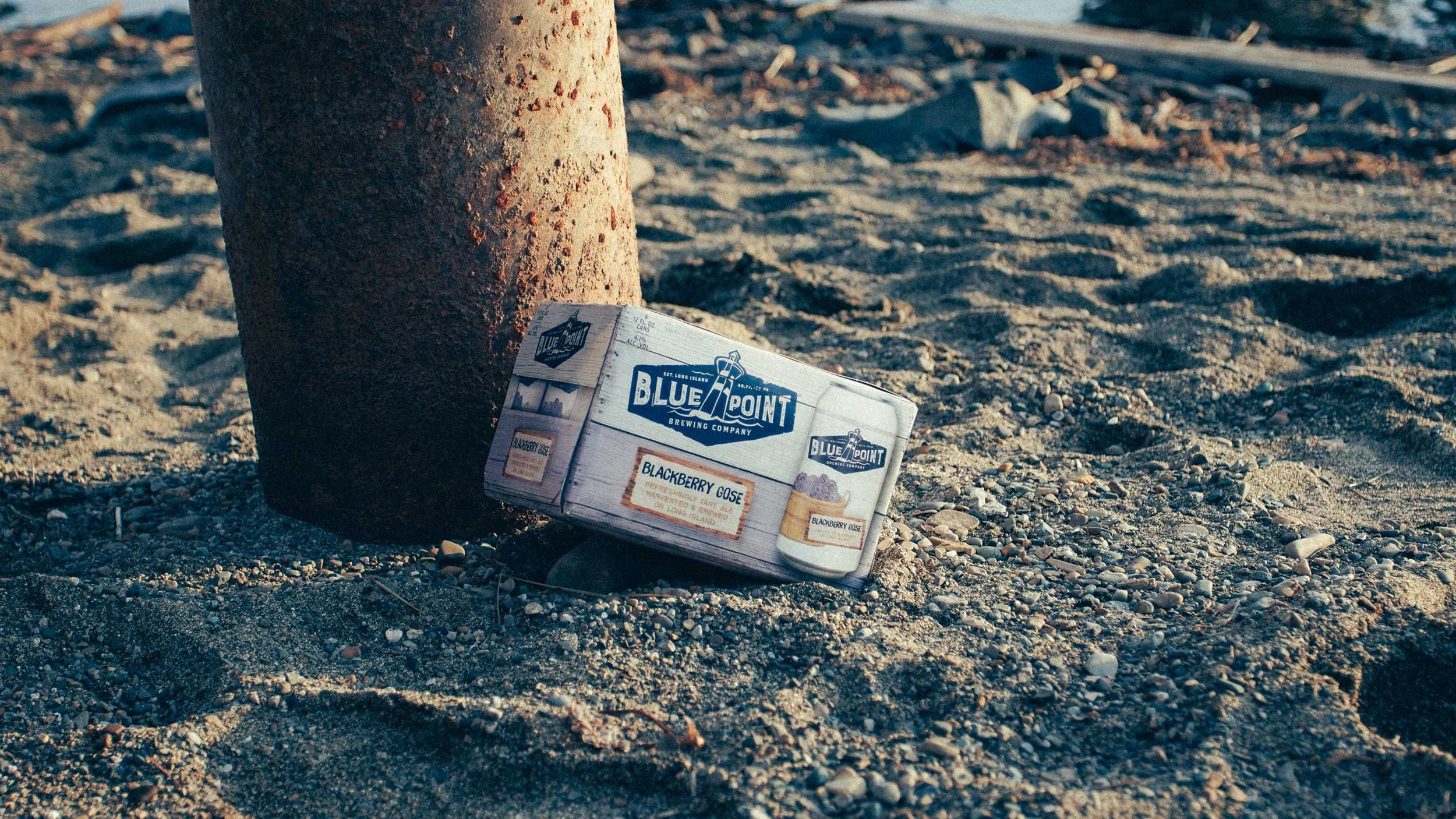
The Blue Point Brewing summer rotator packaging was built around watercolor illustrations that brought a warmth and handcrafted feel to the cans and boxes. Each illustration was designed to complement the existing Blue Point brand aesthetic while introducing a softer, more seasonal texture.
The Blackberry Gose label featured a harvest basket overflowing with blackberries, grounded in the Long Island roots the brewery has always leaned into.
The secondary packaging carried the same illustration language across the box, creating a cohesive shelf presence from every angle.