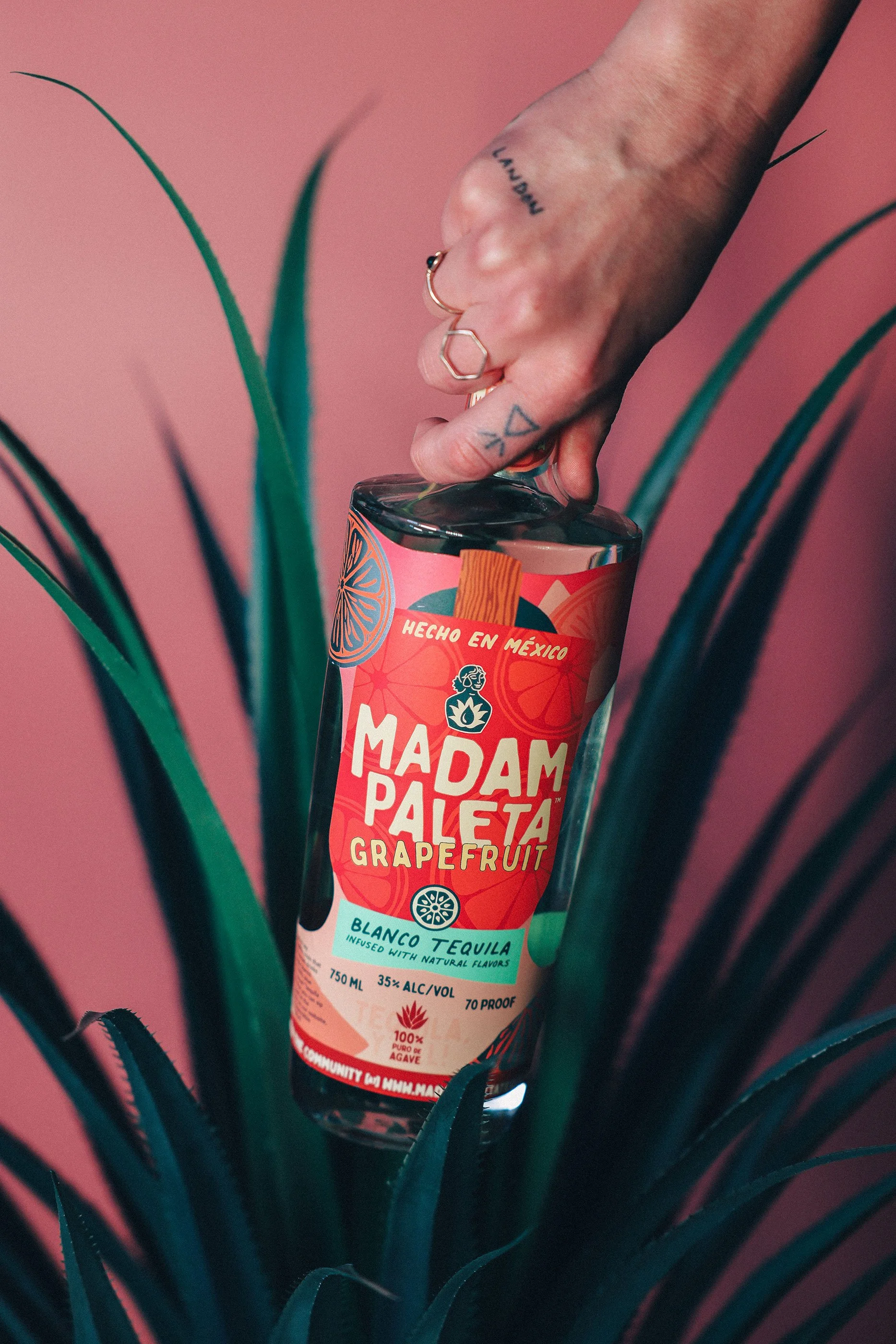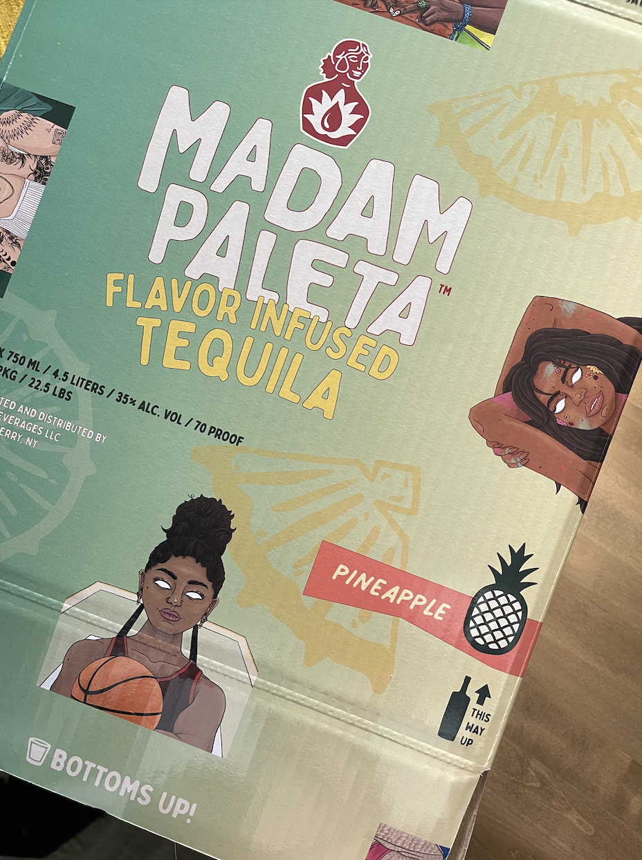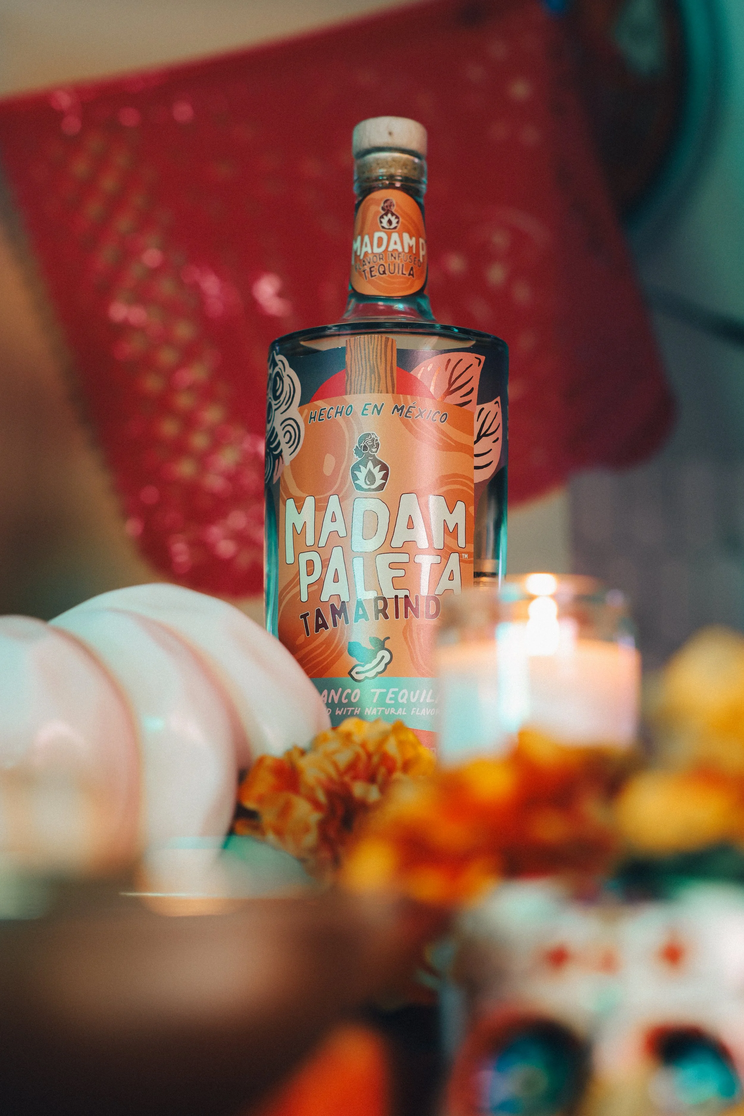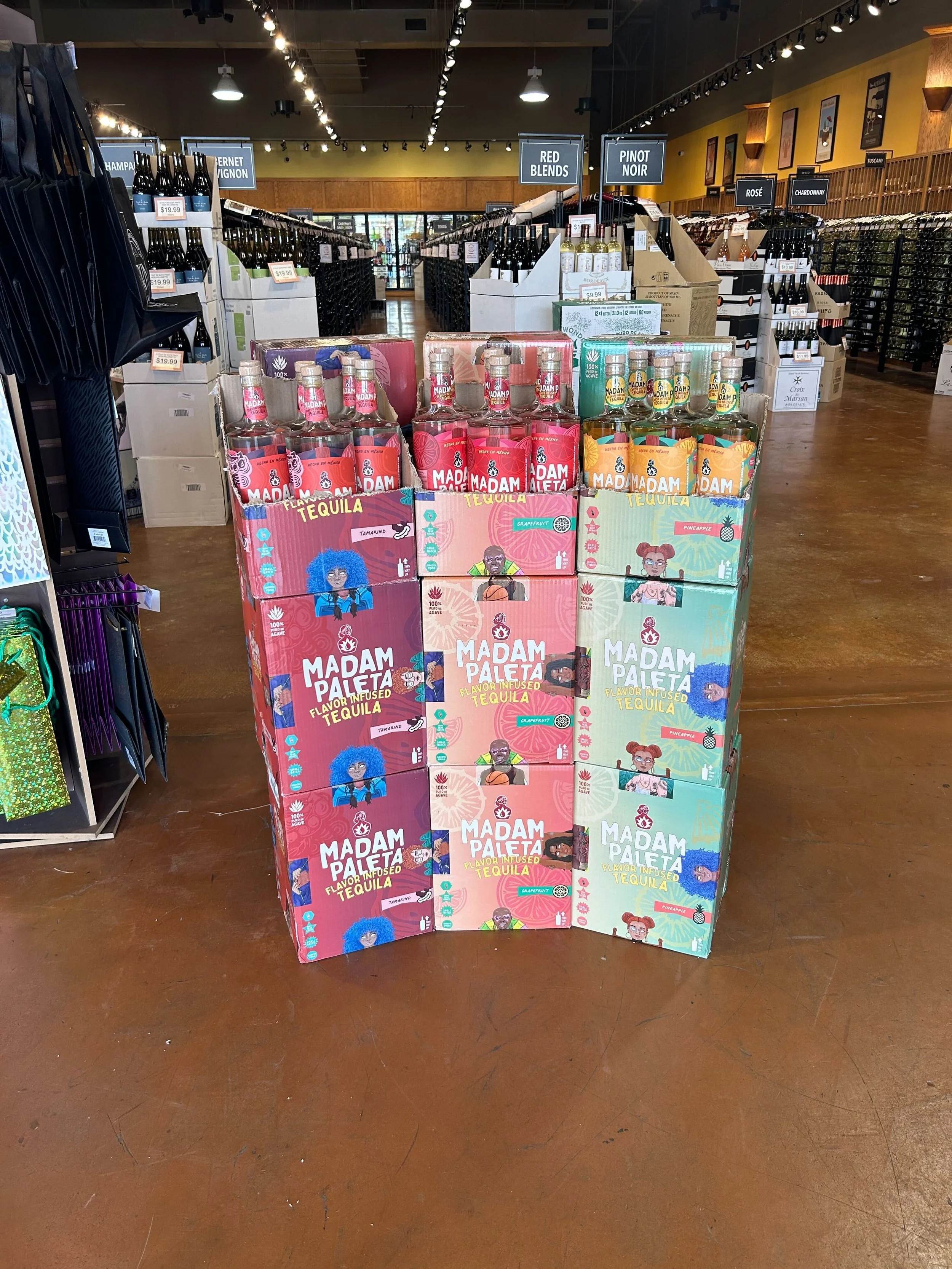
The Double-Gold awarded Madam Paleta packaging system was designed from the ground up to function as the brand in physical form.
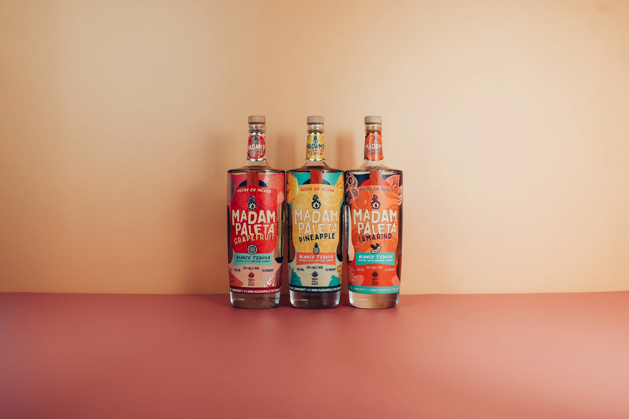
Each bottle label is die cut into an organic paleta shape, nodding to both the brand name and the curves of the bottle itself. Flavor specific color palettes, bright and complementary, shift across the lineup from pineapple to grapefruit to tamarind, with each SKU featuring its own original illustration of a bold, expressive woman rendered in the brand's signature style.
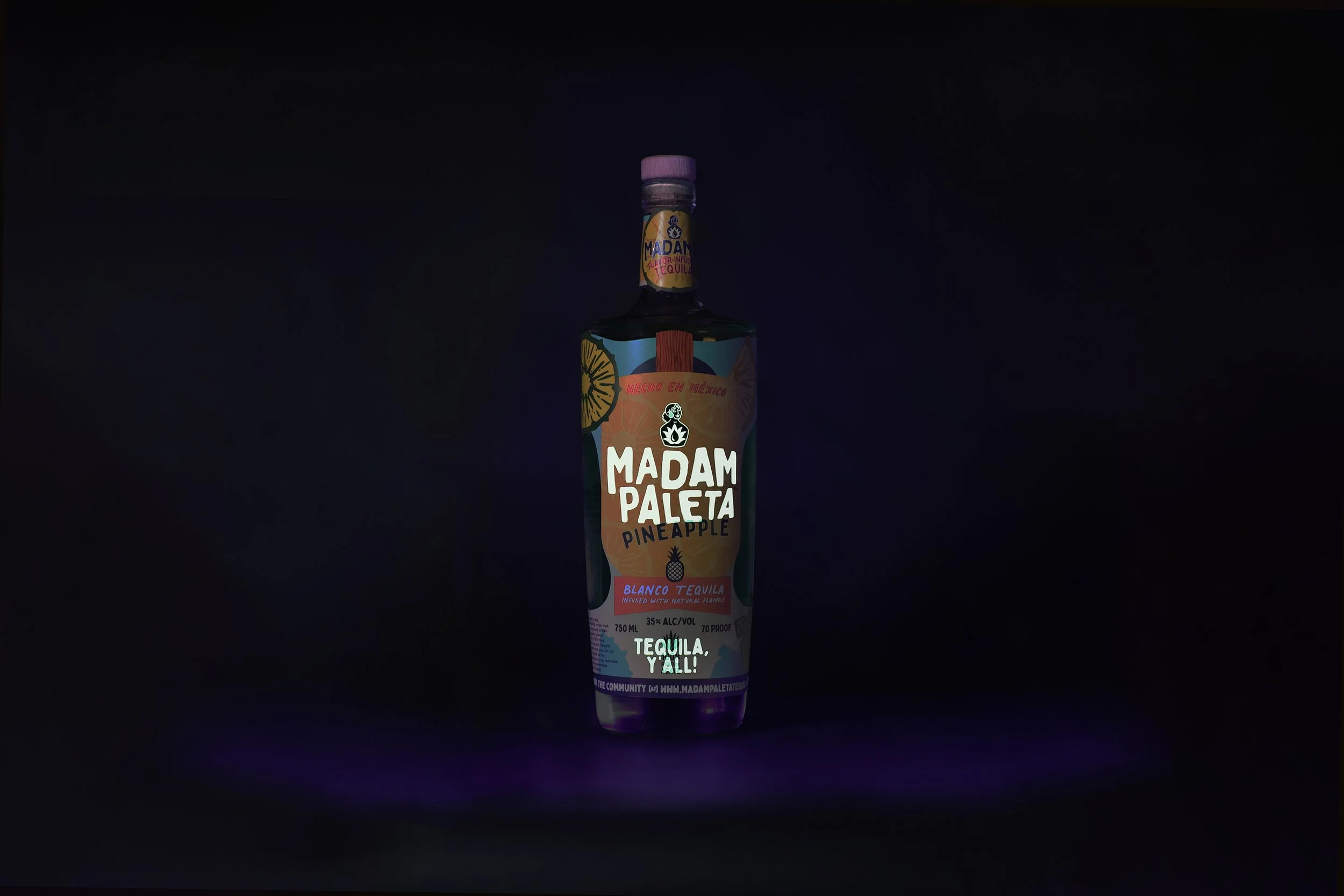
Special printing techniques including metallic embossing and glow in the dark ink keep the packaging vibrant and surprising even in low light environments.
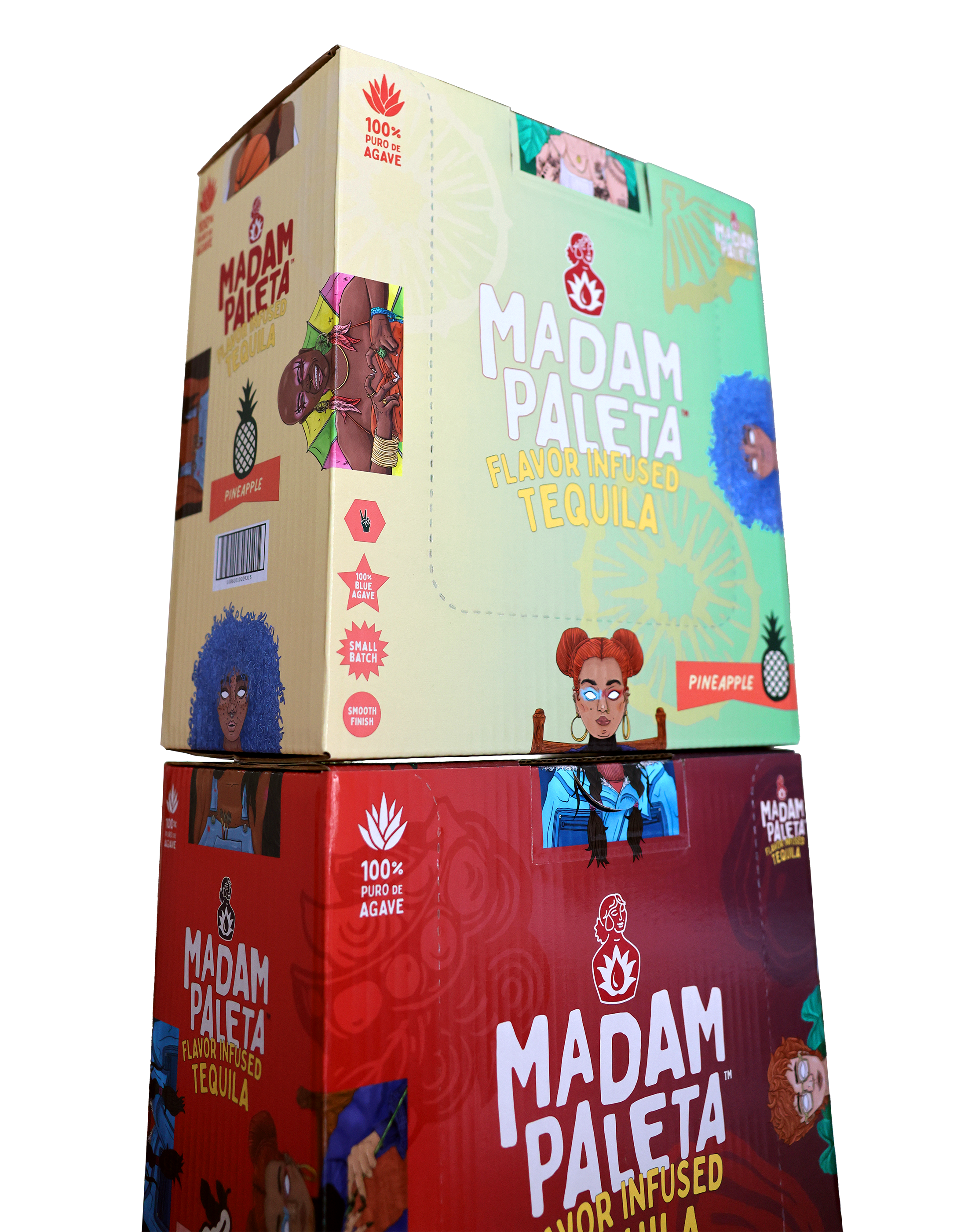
The secondary packaging features the many “madams” that this brand speaks to– badass females from all walks of life, who aren’t willing to compromise on quality in any regard. And, for when the lights go down, Madam Paleta still stays bright and vibrant, with special glow-in-the-dark messaging for all hours of drinking, sipping, and mixing.